Ais Kacang x IDD 2018
Ais Kacang x IDD 2018 is a collaboration project between final year BGDSHU and BIDSHU students. The aim is to present a Malaysian dish, Ais Kacang, and visualize it for a far future. Our group consists of 7 students, 2 from BGDSHU and 5 from BIDSHU. We decided to tackle on overpopulation and how it contributes to pollution. But first, take a look at the team :
After forming our group, we began brainstorming on ideas on how to have a presentable Ais Kacang. We had so many meetings, that it is hard to count the number of times. But our meetings are never dull, cause we always crack jokes and laugh at it for hours. Just look at us here :
But anyway, during the discussion, while we ate our lunch, we started to think of how an Ais Kacang would look like in the future after overpopulation have taken over. Our vision of the situation is that resources would be limited and people would fight each other to obtain their needs. Blood will shed! So, once that discussion was done, we individually started sketching our own ideas to see which would suit the best. In the end, we decided to use back everyone’s sketch by merging it into one. Voila :
We then had our interim presentation to pitch our idea. We volunteered Emma to be our presenter as we felt she had extremely good presenting skills. This is our presentation slides :
After sketching, we started planning out our materials and where to get them. Everyone had to get different items. For me, it was acrylic, watercolour, brushes, Chinese ink, and a palette. We gathered together outside of the Mezzanine Floor on Thursday to start our masterpiece. Take a look at us here enjoying ourselves while making our Ais Kacang :
We really enjoyed ourselves while building the prototype. After building the prototype, Pavitra and I designed the presentation boards for our final presentation. Below are how our boards look like :
On presentation day, we asked Emma to present for us again, after her wonderful presentation during the interim. We brought in our prototype to show our lecturers the outcome of the project. This is us after our presentation with our Ais Kacang :
Click the button below to access the final presentation slides.
My Reflection :
-
I enjoyed my time in this group
-
We had good communication skills when speaking to one another
-
We support one another during the project and make sure each contributed something
-
Overall, it was a well accomplished project and I had lots of fun
Take a look at our exhibition space here :


Ais Kacang x IDD 2018
Ais Kacang x IDD 2018 is a collaboration project between final year BGDSHU and BIDSHU students. The aim is to present a Malaysian dish, Ais Kacang, and visualize it for a far future. Our group consists of 7 students, 2 from BGDSHU and 5 from BIDSHU. We decided to tackle on overpopulation and how it contributes to pollution. But first, take a look at the team :
After forming our group, we began brainstorming on ideas on how to have a presentable Ais Kacang. We had so many meetings, that it is hard to count the number of times. But our meetings are never dull, cause we always crack jokes and laugh at it for hours. Just look at us here :
But anyway, during the discussion, while we ate our lunch, we started to think of how an Ais Kacang would look like in the future after overpopulation have taken over. Our vision of the situation is that resources would be limited and people would fight each other to obtain their needs. Blood will shed! So, once that discussion was done, we individually started sketching our own ideas to see which would suit the best. In the end, we decided to use back everyone’s sketch by merging it into one. Voila :
We then had our interim presentation to pitch our idea. We volunteered Emma to be our presenter as we felt she had extremely good presenting skills. This is our presentation slides :
After sketching, we started planning out our materials and where to get them. Everyone had to get different items. For me, it was acrylic, watercolour, brushes, Chinese ink, and a palette. We gathered together outside of the Mezzanine Floor on Thursday to start our masterpiece. Take a look at us here enjoying ourselves while making our Ais Kacang :
We really enjoyed ourselves while building the prototype. After building the prototype, Pavitra and I designed the presentation boards for our final presentation. Below are how our boards look like :
On presentation day, we asked Emma to present for us again, after her wonderful presentation during the interim. We brought in our prototype to show our lecturers the outcome of the project. This is us after our presentation with our Ais Kacang :
Click the button below to access the final presentation slides.
My Reflection :
-
I enjoyed my time in this group
-
We had good communication skills when speaking to one another
-
We support one another during the project and make sure each contributed something
-
Overall, it was a well accomplished project and I had lots of fun
Take a look at our exhibition space here :

Royale Grad Show 2018
Royale Grad Show 2018: As part of an individual class project, each student is required to create a concept for our upcoming graduation showcase. The name I came up with is Royale because I want to showcase how “grand” my classmates and I are.
Royale is a French adjective which stands for “royal”. Royal essentially is related to a person being independent, organised, and classy with an attitude. Some initial research I did on royal includes typography and logo design related to royalty.
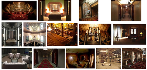
The term “royal” first came to me as an inspiration from FX’s television series American Horror Story: Hotel which had an amazing set interior and deco. The set was meant to have a creepy, lonely, and horror vibe, but the design aspects of the interior was stunningly beautiful. I remember when I first watched the first episode of Hotel, I called the site “creepy with a pinch of royalty”, thus where the term “royal” came from. Take a look at some pictures of the set here:
After that, I started to redefine the term “royal” and “royale” to understand it as a designer point-of-view. Royal does not necessarily needs to mean classy, or whether it needs to be related to hierarchy or monarchy such as Kings and Queens. It can be the uniqueness of it. What differentiates royals from commoners? Sense of style? Attitude? Colours? And what does a designer has to do with any of this?
Here is where I decided what I wanted as Royale, which is “attitude”. I want to show the attitudes of my classmates and how it is similar to the equipments we use (pencils, pens, erasers, etc.). A pencil can be represented as busy but messy, and has many thinking-kind while a pen can be represented as bold and daring, straightforward to the point-kind.
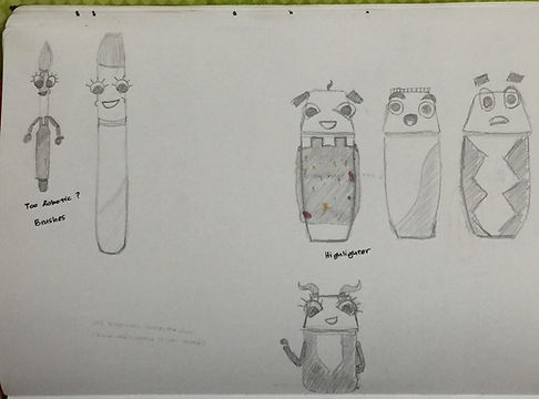
After knowing what I want for my Grad Show, I started to do a mind map of “Royale”, listing down everything I needed to know about the meaning behind it and how to relate it to the concept I’m aiming for. Also, as I wanted to represent us designers with design tools, I started to roughly sketch the items. At first, I was kinda lost at how I wanted the characters to look like, so I just drew simple looking one.
After a few tryouts and sketches, I talked with Mr Sean during my tutorial on how to make my designs look better, rather than plain and boring. This is what we talked about:
While sketching the characters, I started to have a clear direction of the concept. Below is my colour scheme and experimenting with different typefaces. I wanted to go towards a pastel-kind colours for the grad show because I want to show how we are all still young, despite already matured enough for the working world.
Follow up from my tutorial, I also started to design the characters on Illustrator to see how it would look like on digital. Initially, I followed my older sketches, which looked like this:
After creating this illustrations, I consulted Mr Sean about how the direction can continue. With some guidance, he asked me to go beyond. Go different, try bigger, bolder. He also told me to search up on tagline and manifestos that could relate to the concept. So I started to brainstorm and list down a few via YouTube scrolling. At the same time, I also googled on Brosmind, an illustrator practitioner.
Brosmind is an illustrator that practices weird and out-of-the-box drawings of simple things. He makes the real world objects and people into more cartoonish and “fake”. Lets take a look at a few works of Brosmind:
From Brosmind’s works, I got some inspirations for my own project. So I started to do digital illustrations based on new sketches of the characters. The characters resemble a funny, quirky, and happy attitude of a designer. This is what the characters now looks like:
So, there you go! My concept surrounding my idea for my graduation showcase. Even though my concept was not chosen for the pitching, I am happy with what I have done throughout the course for this. I was able to create a concept out of scratch. With that, take a look at my presentation board here for an overall idea of the concept: